
UX/UI, PRODUCT DESIGN, BRANDING
VIVINT.SOLAR

The Challenge
The sales organization needed a way to track and monitor in real-time their progress and stats. They needed to hit certain goals and numbers in order to rise through the ranks and become dominant players in the field.
The sales side is set up like a football team. It was so well done that Vivint Solar became the first organization outside of typical sports to become a part of Team Nike.
The app needed to not only reach the standards and needs of Vivint Solar but now also Nike.
CLIENT
Vivint Solar
ROLE
Lead Product Designer
TECHNOLOGY
Sketch, Figma, Invision, Lucid Charts

PROCESS AT A GLANCE
Discovery
Discover and research to define user scenarios and workflows
Wireframe
Use Cases, Work flow(s), Site Map, Wireframing, Major Interactions
Prototype
Visual design, Style Guide, Screen Mockup’s, Interaction
Validate
Get quick and often feedback from stakeholders and team members
Test
Meet and test actual users and observe user interactions and record results
SUMMARIZE
Validate and learn from users’ behaviors. Analyze user feedback and results from testing. Iterate as needed
The Solution.
To find the right solution, we needed to go back to the drawing whiteboard and start listing out what were the needs/ wants of both the business and the sales reps. This is not an easy task when you are dealing with over 3,000 sales reps. Everyone has an opinion and is eager to voice that opinion if given the opportunity.
Eventually, we have identified enough areas and journey mapped countless scenarios, we felt comfortable enough to start wireframing out some ideas (The great thing about wireframing, is it allows you to get out just enough of a pattern or shape to form the idea and create a story).
After wireframing and prototyping a few key areas, we were able to present the ideas to the sales team, and the executive team to get the buy-off needed to start in on the hi-fidelity mocks and get things ready for final rounds of testing/ iterations and finally developer hand-offs.
During this process, we knew that having too many hands in the pot would not give us the insight or feedback we needed to propel this project. So we created a CAB of a few select reps that we knew would be insightful and offer the meaningful feedback we would need.


“Since having access to the League live app, I now know exactly where I am at with my sales every day. I know how many more I need, I know if I am behind, hell, I even know what my buddy is doing and I can set personal goals to beat him! This app has made me more productive, focused, and on fire!”
During the initial phases, we went through numerous versions of the design. Knowing that we needed to have a lot of information shown, but also keep it clean and edgy enough was vital.


These images reflect where we started from and where we ended up. A lot of this was from constant “show-n-tell” with the CAB that we established. We also had the buy in of the business and all the stake holders.

Original DesignIterated Design
Final Design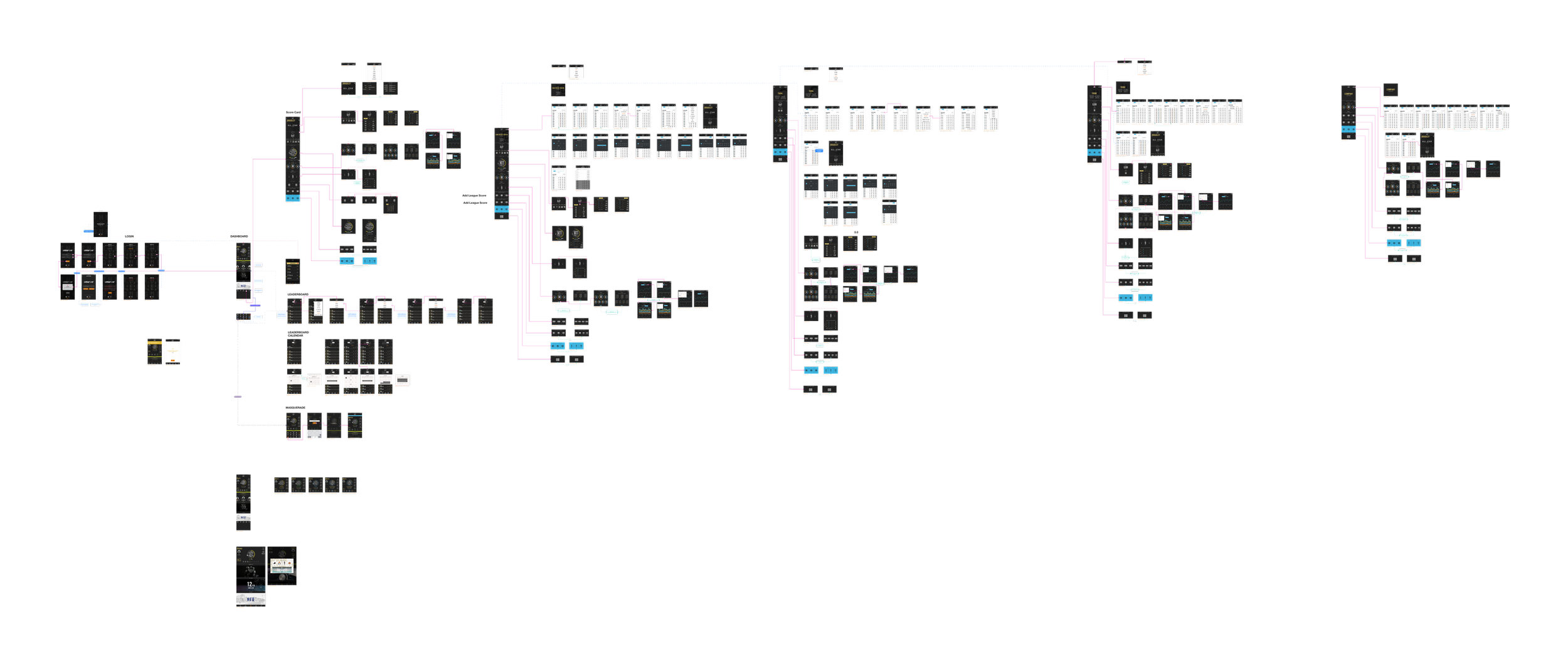

“Having access to League Live has changed the game for me. I am more motivated now that I can see my stats in real-time. It allows me to keep tabs on my team, what we’re doing as a group and where we stand in the company. Killing it with this!”

Mobile – Media Center.
